Papertrail now has a more obvious live “tail” status icon that’s easier to understand. When the viewer is loaded, the live tail status looks like this:

Clicking the icon is one way to pause live logs, and now it communicates that. When clicked, log streaming pauses, so the icon changes to say what clicking the icon again will do:

Finally, when viewing older logs, clicking the icon is a quick way to return to the present time (and resume live logs). The icon changes to communicate that:

Where we started
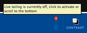
Until this week, the icon always looked like this:
.. and was either lit (as shown) or dimmed.
When the arrow was first implemented, it wasn’t clickable. Later, we and others wanted to be able to quickly return to current logs and that was added. As we learned from conversations with users and our own experience:
1. The arrow gives no hint of being clickable. Some readers may be thinking “It is?!” right now..
2. When clicked, or after scrolling up to historical logs, the icon became less vibrant. This was meant to show that live tail was paused. This one also didn’t hint at its interactivity. Also, even after realizing the arrow was clickable, many users still didn’t know what it did.
Finally, the lit and dimmed icons were so subtly different that some users didn’t notice when live tail was paused.
Obvious, yet elegant
An interface element needs to be obvious enough to be discovered the first time, yet elegant – and out of the way – for every subsequent use. Although these two considerations aren’t polar opposites, they’re close.
This icon leaned heavily towards elegance: it looks good and after being used a few times, the behavior is fairly clear. If Papertrail only served a tiny set of power users – 10 people who used and talked about Papertrail all day – a subtle icon with subtle behavior might have done the job. Papertrail serves the Internet, though, and with thousands of users, it didn’t.
What we considered
In a word: everything. Papertrail uses GitHub pull requests to discuss product changes, including this one. GitHub posted a giant screenshot of one of their long-lived pull requests and our pull request for this icon change isn’t too different.
Over five months, we debated – and in many cases, implemented and tried – different solutions. Here’s three that we considered and rejected:
1. Change something other than brightness
When scrolled up, a red exclamation point indicates that something important has changed: logs are no longer streaming. Problem is that it’s actually too loud, and when the exclamation point is black or gray, not obvious enough.
It’s trying to show too many things (arrow, exclamation point) at once, too, which was a sign we’re trying to shoehorn too much meaning into one icon. And other than when the tooltip is active, it’s no more obvious that the icon is clickable.
2. Add words

Okay, the default icon needs to be easier to understand understand. Let’s add some words and use an icon that the world recognizes. Putting words underneath definitely helped indicate that clicking would do something. This variation is confusing because the icon shows what clicking will do (pause), yet the words said the current state (live tail).
3. In-app tutorial
One option was implementing a tutorial for new users instead of making the icon behavior more obvious. This was easy to reject: when we use other apps, we rarely finish the tutorial (next.. next..) and almost never enjoy them. If it’s not good enough for us as users, it’s sure not good enough for our users.
Also, a standalone tutorial was already one click away (and linked to during setup), so the subset of users who might have enjoyed an intro were probably already satisfied. The icon needed to be clearer to the rest of us.
Iterating
We tried variants of these, like just the icon, just words, different words (live, tail), and using the icon to show the current state instead of what will happen when clicked.
In testing, we realized that it needs to convey three situations, not two:
1. logs are live (and clicking will pause)
2. logs are paused (and clicking will resume)
3. logs are paused (and clicking will resume and return to current, as when viewing older logs)
Even aside from logs, these are all somewhat unusual. A user is unlikely to have encountered the same need in other apps, so the behavior needs to be pretty obvious.
That led to the result, which uses 3 different icons. Two are related (pause, tail) and clearly, concisely show what clicking will do:
One is visibly different (arrow) because when viewing older logs, one fact is most important: that clicking the icon will return to current logs.

Also, all 3 states now have short tooltips. We may change that if the mouseover becomes annoying, like by only showing the tooltips during someone’s first few uses.
Enjoy
What you see is the best combination of discoverability and elegance we could find. We hope this more obvious, clearer interface makes this element usable by more users.
See what you think. See a change that’s worth the tradeoff between discoverability and elegance? Something completely different? Let us know.